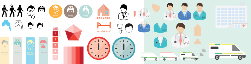
Here is a quick update of some graphic design work underway in our ED patient pathway project. Currently, we are looking at developing a highly visual journey map to explain how patients are prioritised in ED and their subsequent care pathway.
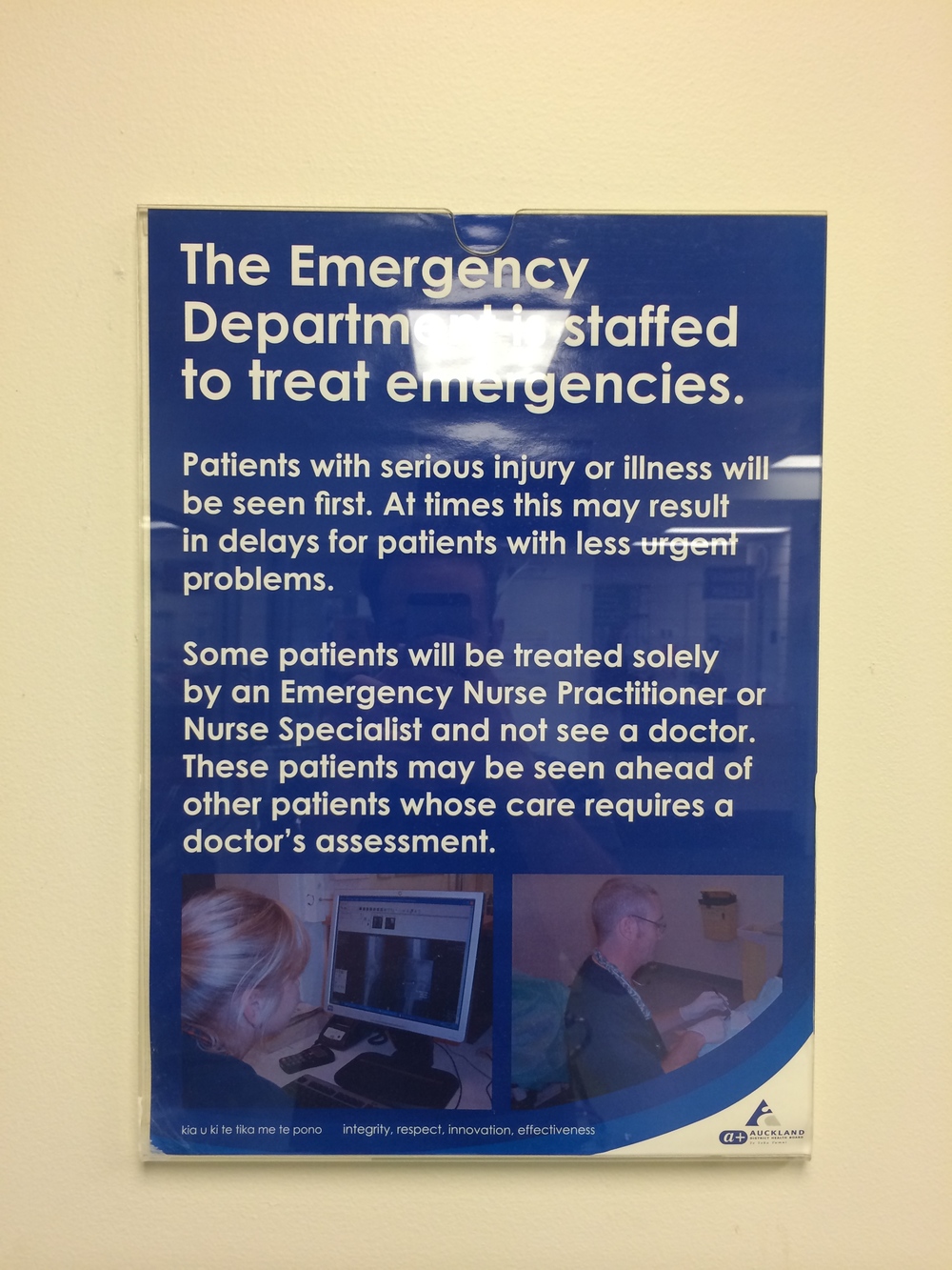
Explaining information to people through text may be very informative and thorough, but an A4 poster on a blank wall often goes unnoticed, and makes no sense to a person who does not speak English. We have embarked on developing a family of descriptive and clear Icon/symbols communicating key messages to patients who have to wait in the ED.
It is no secret that symbols are an effective method for communicating without relying on text: our challenge is to develop a clear visual language which both fits the hospital environment and engages those waiting for care. Some of the work featured here moves away from conventional human figure icons and begins to explore how restrained yet playful style might better communicate with patients. How much detail could be used in the iconography before becoming overly complex? This practical design work will be shaped and developed as we continue to sure up our key research insights.