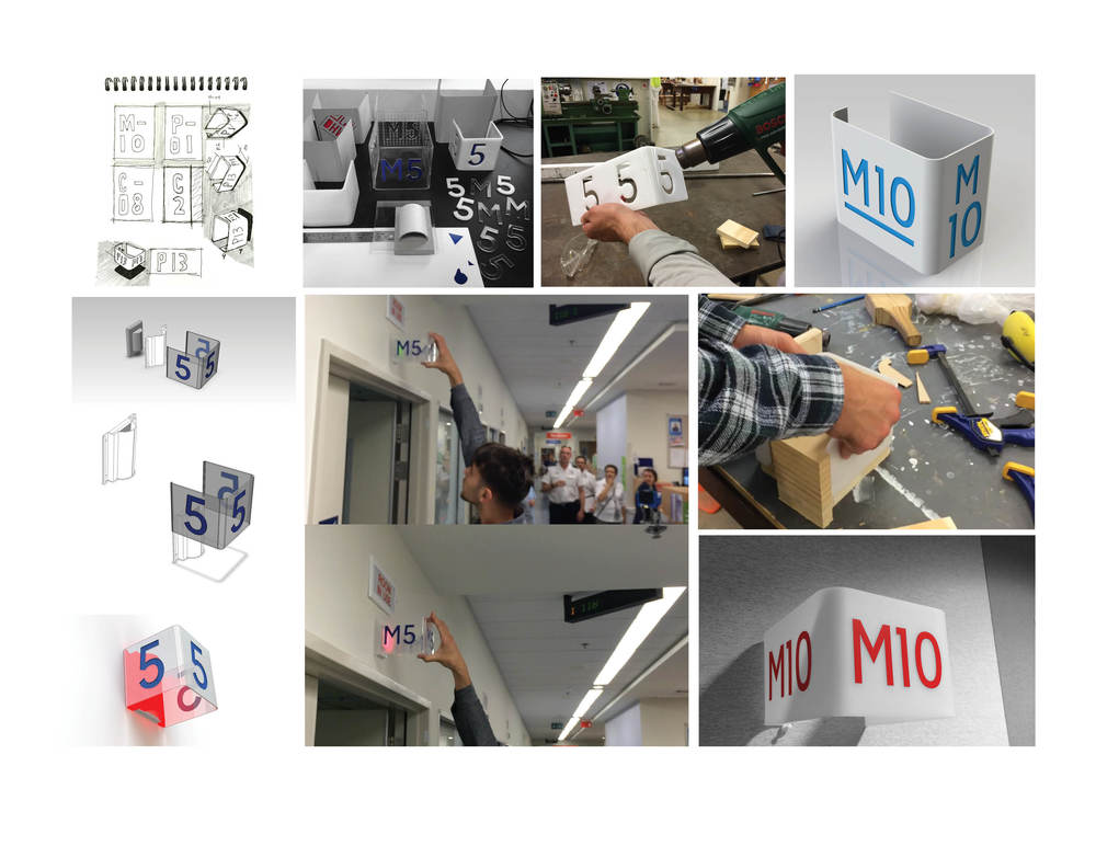

One of the spin-off projects from developing a visual patient journey map includes a simple 3D room sign. The concept responds to the issue of obscured and unclear room signage, noted by the ED nurse manager on a walkthrough earlier in the project. An acrylic sheet is heat bent to create three faces for the room number and is visible for the patients and families walking in the corridors, as well as the nurses station in the centre of the ED. We have received some great feedback from the Facilities Nurse, who supervised a short trial of a prototype in-situ, and gave us the green light to resolve a fully functioning prototype for testing. An exciting possibility for the concept lies in an existing LED light panel above each room. The warning light has three settings to inform the nurses about what is happing in each room: green, orange and red. Our hope is that if the acrylic sign was clear with opaque numbers, it could retrofit directly over the LED panel, causing the sign to illuminate…
https://www.youtube.com/watch?v=CISOyItVEdk&feature=youtu.be
After a second go at prototyping around the ED Signage, we uncovered a few key issues to be resolved. As identified in previous posts, we identified the opportunity to retrofit the three sided sign over the existing warning light panel, which has green, orange and red LEDs for different types of assistance. The goal of this concept was to use the sign as a catalyst for enhancing the luminosity of these LED panels. We built a series of prototypes exploring the scale, form and different material transparencies...
Issue 1: The lettering needs to be explicitly clear. After building a prototype with transparent material, we found that people would see straight through to the lettering on the opposite face. To resolve this, we created a 'fogged' surface by sanding the clear acrylic. This fogged surface behaved really well with the red LEDs, reflecting the light and causing the sign to glow (see video below).
Issue 2: This leads to the second issue encountered through making and testing. We had the opportunity to show the nursing staff in the ED and receive their feedback. Although they were really impressed with the retrofit concept, they felt that the signage was slightly obstructing their view when the dimmer, green LED's were flashing.
We discussed with the nursing staff about their conclusions from the testing session in ED. It was resolved that although we had some success in achieving a 'glowing' effect, there was too much risk involved in obscuring the warning lights. They also felt that the signage would work better at a lower height to allow people from all directions easily navigation through the department. From here, we will further develop the visual impact and aesthetics of the design. We aim to have a new round of prototypes installed in the space very soon so check back soon!