

A current side project underway at the lab that involves rethinking the design and function of the hospital ID card. Typically, the ID card is attached to a lanyard hanging around the neck of a staff member. They can also be clipped onto clothing.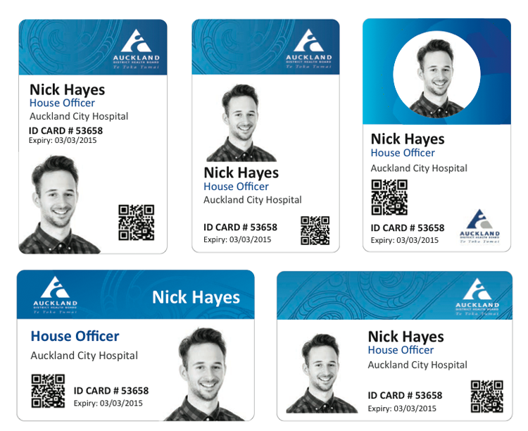 At face value, the project seemed to be re-branding exercise, redesigning the graphics of the current card. But pushing the boat out a little, we began to question what the underlying purpose of the ID card was: How easy is it for patients to identify staff members? What are the key problems with the existing, lanyard/clip system? With a little research, we discovered that staff carried around three items on their lanyard: an Id card a coffee card and swipe card- how might such functions be combined or integrated? A nurse tipped us off about the infection risk of lanyard card holders, and some key secondary sources supported this issue of spreading infection through the current system. How might an ID card system actively promote sanitation as staff move around the hospital? With these new insights, we have jumped back into ideation around this problem, and are looking for opportunities to develop an ID system that is both feasible and effective for all users:


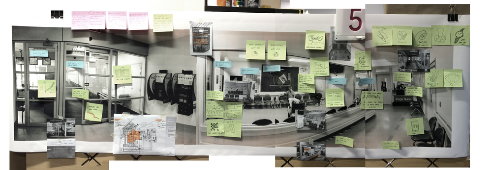
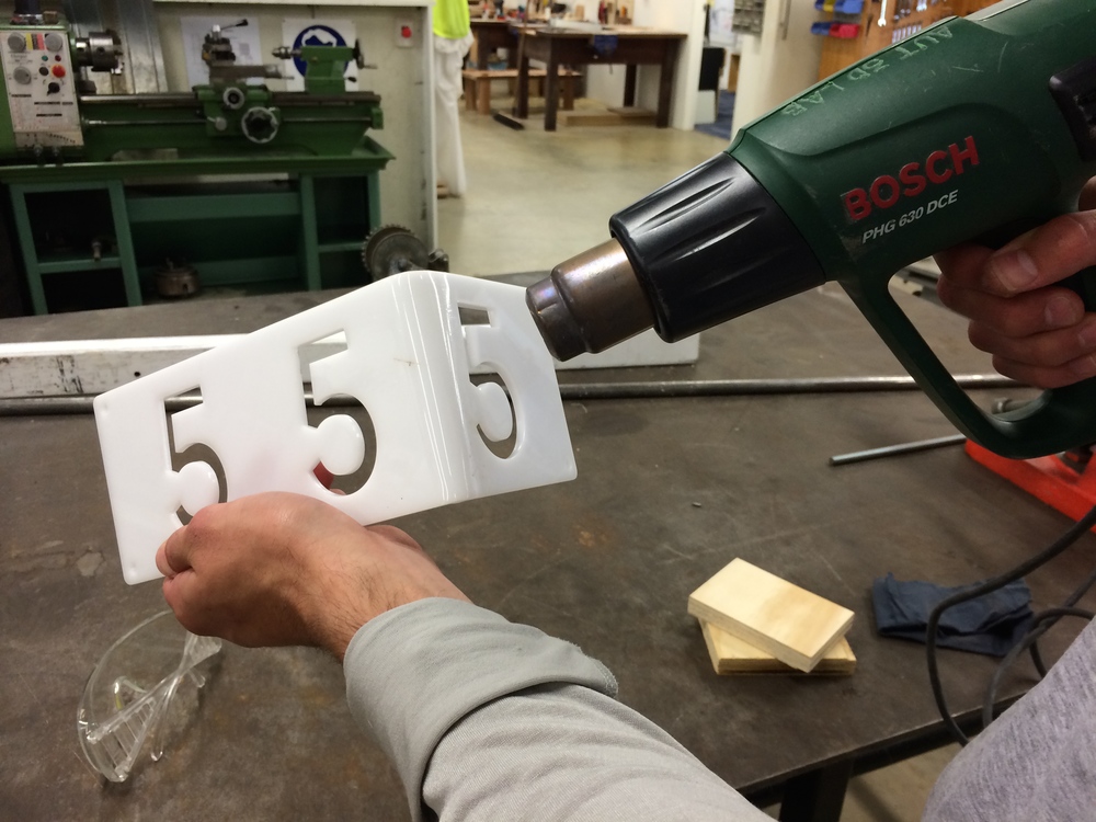
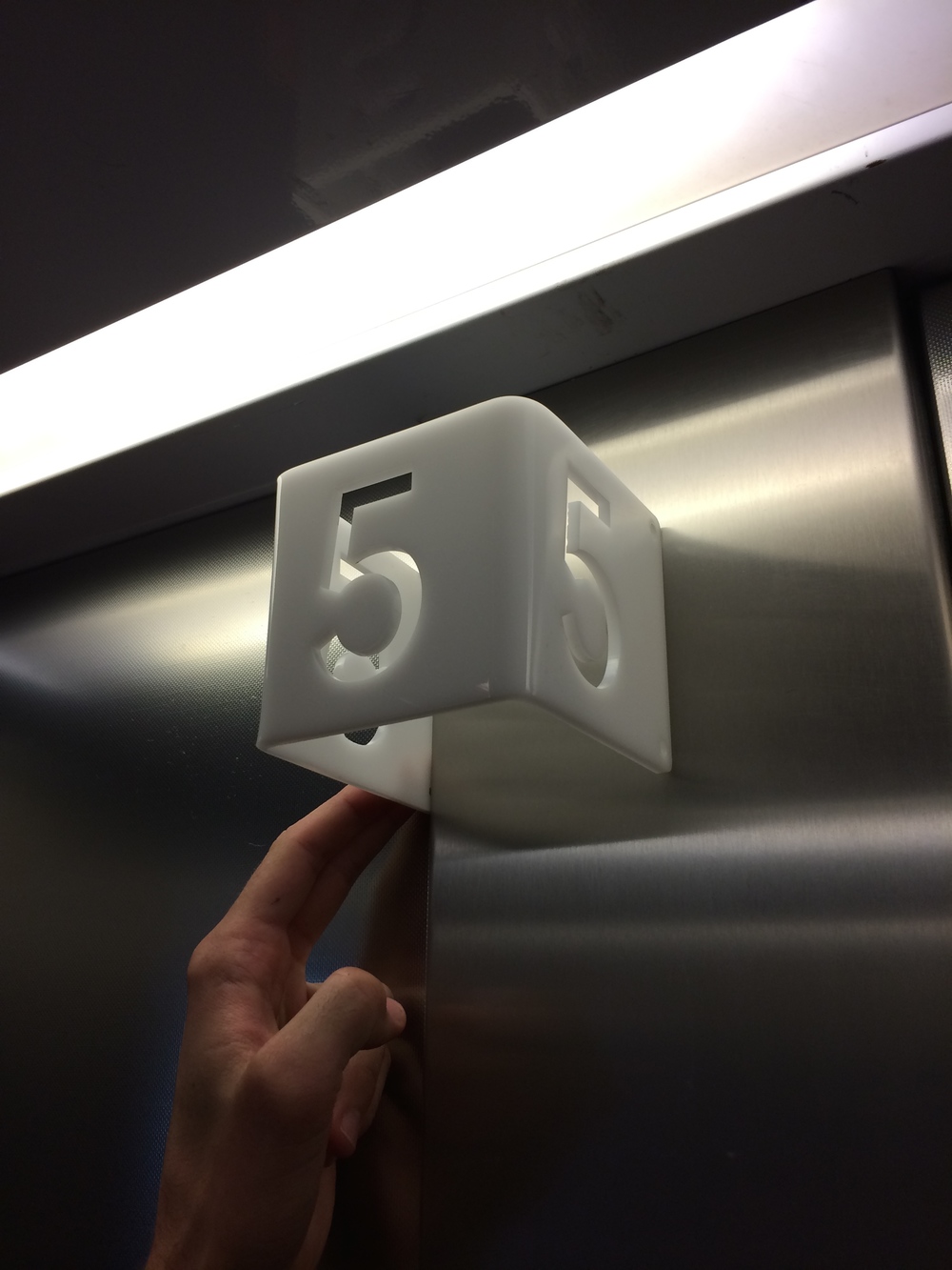
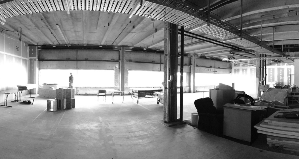
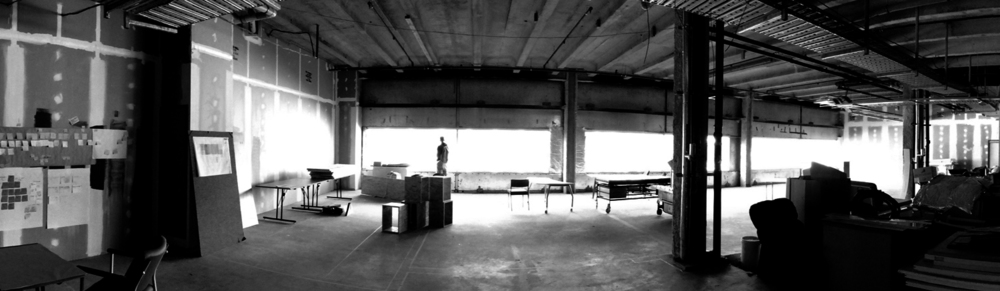 Its been on the books for sometime, but working on site at Auckland Hospital has seemed to be a crucial aspect of the collaboration between AUT and the ADHB.